For those of you who have known us since the beginning, there have been some changes at RadioKing! Created in 2013 in northern France, RadioKing has continued to grow and evolve over the years. The Radio Manager has quickly developed into an elaborate and powerful tool.
One thing has stayed the same, our mission: Get Heard Everywhere.
Making your voice heard through online radio is what RadioKing is all about.
After multiple product evolutions, it’s time for our brand to get a makeover with a whole new visual identity.
Why? To harmonize our different media: from the website, to the radio manager, through our social networks.
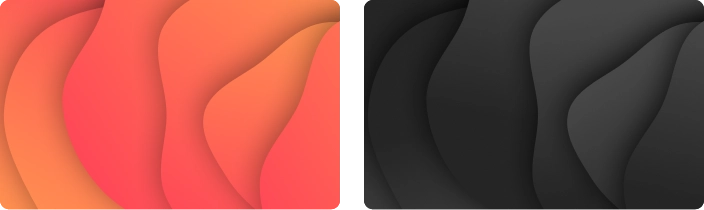
We have modernized it with a trendy typography while keeping it simple. We also added a new color gradient to match our evolution and image.
Colors
Orange has always been the trademark of RadioKing, so we wanted to stay true to our roots. But we also wanted to assert ourselves through a larger color palette. That’s why we created this gradient color scheme that goes all the way to charcoal gray and black, reminding us of the darkness of a radio studio.
Back to our roots
Through this graphic charter we wanted to accentuate airwaves. Emphasizing radio waves is the perfect way for RadioKing to highlight the essence of the company and its mission to “get heard everywhere”. That’s why nothing is linear in this new design, you’ll only find curves and waves.
This new identity launch is just the beginning of a new chapter for RadioKing. We hope you will be by our side for the rest of our adventures.
Want to know more?
You can download our Brand Book and learn more about us.