Your online radio station deserves more than just great music and engaging shows, it needs a strong visual identity that makes it instantly recognizable. A well-designed online radio logo is the heart of that identity. It’s the very first impression people get when they discover your station, and it can communicate your style, your genre, and even your personality before a single note plays.
Whether you’re running a niche indie station, a talk-show network, or a 24/7 mix of your favorite genres, a captivating logo helps your audience instantly connect with your brand and remember it. The best part? You don’t have to be a professional designer or spend hundreds on custom design work. With a clear approach and the right tools, anyone can create a strong, effective logo.
In this guide, we’ll explore the essential steps to creating a great online radio logo, one that truly represents your station and resonates with your audience.
1/ Define your station’s personality
2/ Choose the right style
3/ Pick a color palette
4/ Select the right font
5/ Keep it simple
6/ Design tools
7/ Get feedback
8/ Canva tutorial
1. Define Your Station’s Personality
Before you even open a design tool, take the time to reflect on what your radio station stands for. Your logo should visually capture your station’s personality, giving people a sense of what they’ll experience when they tune in. Ask yourself:
- What’s my station’s genre or theme? Is it a smooth jazz station, a hyper-energetic EDM mix, or a cozy talk-radio channel for late-night discussions?
- What emotions do I want to evoke? Do you want your audience to feel nostalgia, excitement, peace, or adrenaline?
- Who is my target audience? Are you speaking to teens looking for the latest hits, professionals who want background music while they work, or a local community with shared cultural roots?
Your answers to these questions will guide every visual choice: colors, shapes, fonts, and icons. For example, a retro-themed rock station might lean toward vintage typography and muted, warm tones, while a cutting-edge electronic music station might favor neon colors and sharp, modern lines. Knowing your personality is the foundation of a memorable logo!
2. Choose the Right Style
Now that you understand your station’s personality, it’s time to decide on the type of logo that best represents it. There are a few popular styles that work particularly well for online radios:
- Icon-based logos: These feature a simple yet recognizable symbol, such as a microphone, vinyl record, headphones, or radio waves. They’re easy to identify, even at small sizes, and they work well as social media avatars or app icons.
- Wordmark logos: This type focuses entirely on typography. If your station name is unique, catchy, or already evokes a clear feeling (like “Midnight Groove” or “RetroVibes FM”), a stylish wordmark can be enough.
- Combination logos: These pair a symbol with text, giving you the flexibility to use the icon alone when space is limited, or the full design for banners and larger formats.
If you’re unsure where to start, keep it simple. A busy, overly detailed online radio logo can become unreadable when resized for small screens. Minimalist logos are timeless, adaptable, and easier for listeners to remember.
3. Pick a Color Palette
Colors are powerful, they instantly evoke feelings and associations. Choosing the right color palette will set the mood for your station and reinforce its personality. Here’s a quick guide:
- Bright colors (red, orange, yellow) feel energetic, fun, and attention-grabbing. They’re perfect for upbeat pop stations or stations aimed at younger audiences.
- Cool tones (blue, green, purple) evoke calm, professionalism, or creativity. They’re great for talk shows, chillout stations, or classical music.
- Black & white or neutral tones give a timeless, elegant look and adapt easily across different backgrounds.
Also think about where your logo will appear: your website, mobile apps, social media, and maybe even on merch. A good logo should look equally good on both light and dark backgrounds. You might even create alternate versions, like a full-color logo for your website and a simple black-and-white one for watermarks or print.
For example, RadioKing’s logo works on various background colors by having adaptable variations, ensuring it always stays readable and recognizable.
4. Select the Right Font
Typography can completely change the way your station name feels. A bold, modern font will suggest energy and cutting-edge sounds, while a handwritten or serif font can feel warm, retro, or artistic. When choosing a font, keep in mind:
- Legibility is key. Avoid overly decorative fonts that are hard to read, especially when your logo is displayed at small sizes on mobile screens.
- Match your vibe. A hip-hop station might go for bold, urban fonts, while a soft acoustic station might choose a more organic, flowing style.
- Don’t mix too many fonts. One or two complementary styles are plenty—too many will make your design look messy.
Your station’s name is often the centerpiece of the logo, so it should be clear, memorable, and aligned with your brand personality.
5. Keep Your Online Radio Logo Simple
When it comes to logos, simplicity is power. The most iconic logos, such as Spotify, Apple, Nike, are instantly recognizable with minimal details. A clean, simple design ensures your logo remains versatile and works across all mediums. Ask yourself:
- Will my logo still look good as a tiny app icon?
- Can I recognize it instantly without reading the text?
- Is it easy to reproduce on merchandise, flyers, or social media banners?
Avoid overly complex illustrations or too many tiny details. Remember, your logo doesn’t need to explain everything about your station. It just needs to create an immediate visual connection that draws people in.
6. Use Easy Design Tools
Gone are the days when you needed expensive software like Photoshop or Illustrator to make a great logo. Today, there are free, beginner-friendly tools that can help you design a professional-looking logo in minutes:
- Canva: Ideal for beginners, with thousands of customizable templates and easy drag-and-drop editing.
- Adobe Express: A simple yet powerful tool for quick designs.
- Looka: AI-powered logo generator that create designs based on your input.
Start with a template that feels close to your station’s personality, then customize it with your colors, fonts, and icons. This is the fastest way to create something unique without starting from scratch.
7. Test and Get Feedback
Before finalizing your logo, test it with fresh eyes. Share it with friends, family, or even a small group of listeners. Ask them:
- Does this logo match the feeling of the station?
- Is it easy to read and recognize?
- Would it stand out among other online radios?
Sometimes, what looks perfect to you might be confusing or hard to read for others. Gathering honest feedback ensures your final design is strong and effective.
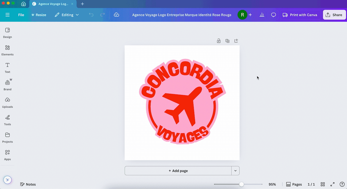
Create Your Online Radio Logo with Canva: Tutorial
Want a practical way to get started? Here’s how to make your own radio logo using Canva (no design skills required!)
1/ Create a free Canva account
- Go to canva.com and sign up for free if you don’t already have an account.
2/ Search for “Logo”
- In the search bar, type “logo” and hit Enter.
- You’ll see thousands of ready-made templates, from modern and minimal to bold and playful.
3/ Pick a template that matches your vibe
- Choose something simple and relevant. Don’t worry about it being perfect as you’ll customize it anyway.
4/ Customize the design
- Change the text → Add your station’s name.
- Swap colors → Match your chosen color palette.
- Add icons → Search for “microphone,” “headphones,” or “music” in the Elements tab.
- Adjust fonts → Pick something bold, modern, retro, or handwritten depending on your style.
5/ Download your logo
- When you’re happy with the result, click Share → Download → PNG (transparent background).
- Save multiple versions: one with a background, one without, and one simplified for social media icons.
💡 Pro tip: Keep a copy of the editable Canva file so you can update or tweak it later if needed.
Logo Do’s & Don’ts
Here’s a quick cheat sheet to avoid common logo mistakes:
✅ DO:
- Keep it simple and recognizable
- Make sure it’s readable at all sizes
- Use colors and fonts that match your station’s vibe
- Create versions with and without text for flexibility
- Test it on different backgrounds and screen sizes
❌ DON’T:
- Use too many colors or fonts
- Add tiny details that disappear when scaled down
- Copy another station’s logo, be original!
- Follow trends blindly (they can look outdated fast)
- Forget to test it on mobile screens and small icons
Your online radio logo is more than just a pretty image, it’s the face of your station, the symbol your listeners will associate with your shows, your music, and your community. A strong logo builds trust, improves brand recognition, and helps you stand out in a crowded digital landscape.
By taking the time to define your station’s personality, choosing a clear style, picking the right colors and fonts, and keeping things simple, you’ll create a visual identity that reflects who you are. Even without design experience, tools like Canva make it easy to bring your ideas to life.